Responsive Website Redesign
LanguageBear.com - Writing & Translation Services
LanguageBear is a leading provider of Content Writing and Translation & Localisation services for some of the biggest brands in the casino and sports betting industry, while also working across many additional sectors.
As the lead UX/UI designer on this project, my focus was on redesigning the visual identity of the company. The goal was to attract new companies as clients and more content writers as freelancers.
The old design had not been updated in >7 years. It used a generic template, which in my UX research was described as "unprofessional" and "silly" and did not resonate with the culture and voice of the brand.
Therefore, a brand overhaul was necessary, alongside with new pages and features, to build credibility, improve redirection from the website to the ERP platform and enhance the overall aesthetic of the brand and functionality of the website.
My role
target audience
Scope of work
Tools Used
Year
Solutions
Poor User Engagement & Redirection
Currently, the website primarily serves as a trust check but does not encourage user engagement. The ineffective redirection of users from the website to the platform fails to nudge clients to order services through the site itself. Instead, they send emails back and forth, which is time-consuming for both the clients and managers.
Improving CTAs and Platform Showcase
I designed clear and compelling calls-to-action (CTAs), a new Registration/Log In flow, and a section showcasing the platform that guided users to explore and utilize the services on the platform. I strategically placed client testimonials and CTAs to drive user engagement.
Unclear Job Application Process
The website does not provide clear and straightforward instructions for linguists to apply for jobs, creating a barrier for talented professionals who may be interested in working with the company.
Simplifying the Job Application Process
I created a dedicated page for job opportunities with easy-to-follow guidelines and a straightforward application process. I offered FAQs and support to assist applicants.
Outdated Aesthetic
My target audience research shows that the outdated and playful aesthetic does not resonate well with larger companies, making it more difficult to attract and secure partnerships. The website lacks a professional and corporate feel, which undermines its credibility.
Redesigning the Visual Identity
To address the outdated appearance and lack of corporate feel, a visual redesign is essential. This includes updating the design language, color palette, typography, components, iconography, imagery, spacing & gridlines, to convey professionalism, establish credibility and attract larger companies.
Generic (Stock) Visuals
The colors and illustrations used throughout the website give the impression of being unoriginal and also contribute to its outdated look.
Refreshing the Illustrations and Graphics
I updated the color scheme, used custom iconography and high-quality graphics to create a more credible and authoritative feel that aligns with the brand identity and resonates with our target audience.
Design Process
Discover & Strategise
Wireframing, Prototyping & Design
Revisions
Feedback is gathered, issues are identified, and refinements are made to improve the design.
Redesign Preview
Scroll over the frames below to preview the full pages.
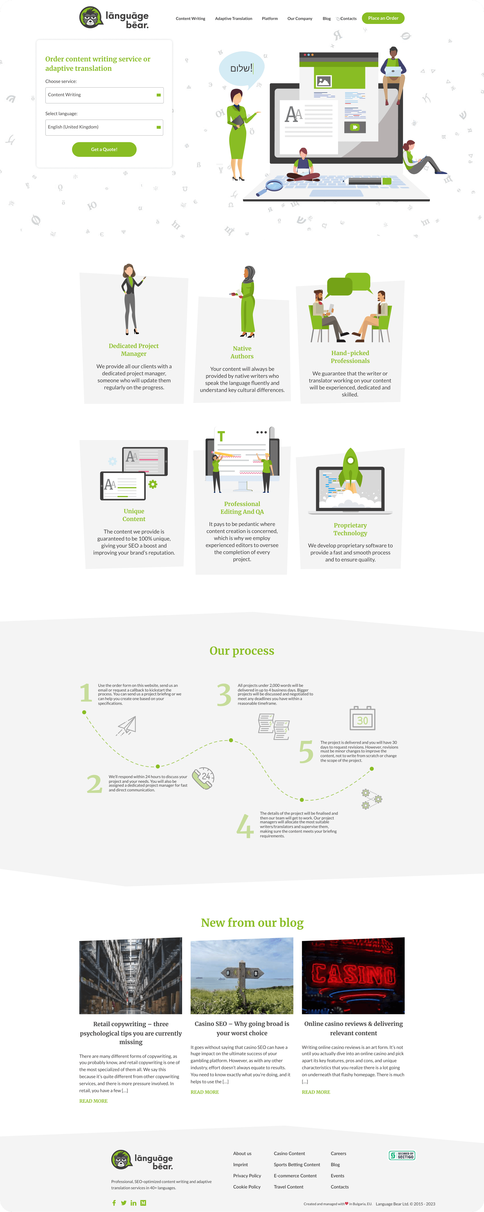
Redesigned Home Page
Old Design for Reference
Problem
The old homepage had a dated design that lacked visual hierarchy and did not effectively communicate the company’s services, value proposition, or credibility. User engagement was low, and the bounce rate was high due to poor navigation and insufficient CTAs.
Solutions
Enhanced Visual Hierarchy - Introduced a bold headline to capture user attention, highlighted the company’s key strengths, such as “1500+ linguists,” with clear icons and supporting statistics.
Service Showcase - Designed an interactive service section featuring industry-specific categories, integrated a CTA for each service, leading users directly to detailed service pages.
Building Trust and Credibility - Added logos of trusted clients to build credibility and prominently displayed upcoming events to emphasize industry presence.
Proprietary Platform Introduction - Created a section to highlight the company’s ERP platform, detailing features like order creation, progress tracking, and API integrations to attract companies as clients.
Client-Centric Approach - Developed a “Why Choose Us” section with visuals showcasing the dedicated project manager and team collaboration.
Responsive and Modern UI - Updated typography, iconography, and color palette to align with modern design trends and optimized the page for mobile and tablet devices, ensuring consistency across all screen sizes.
Desired Outcomes
Decrease in navigation drop-offs;
Increase in retention and mobile engagement;
Increase in conversion rates across the site;
Stronger Brand Credibility, contributing to a boost in client retention rates;
Improved SEO Ranking;
Streamlined Client Communication due to simplified quote request;
Increase in inquiries due to Centralized and more Contact Methods;
Stronger Visual Identity.
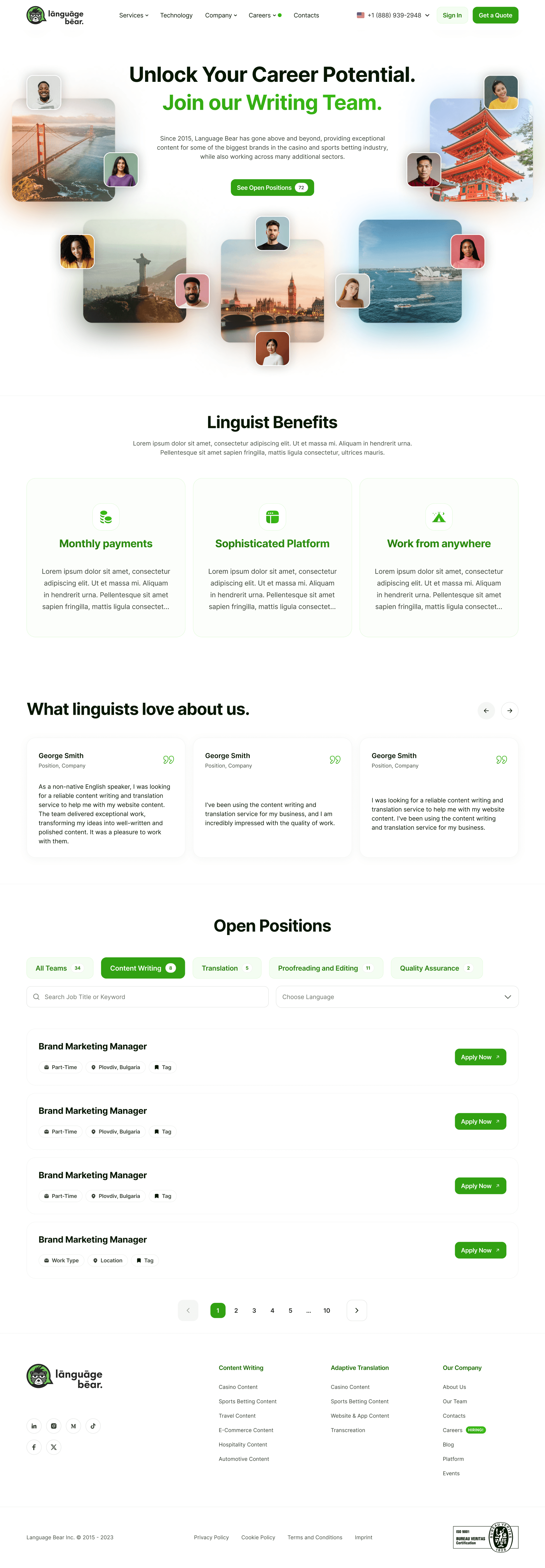
Careers Page
Problem
The company was using a different platform for the Careers Page, which made it challenging to showcase job openings, explain company culture, and career growth opportunities.
Solution
Designed a new Careers Page tailored to highlight global job openings, benefits, and testimonials from current employees.
Created an intuitive application flow, allowing candidates to filter jobs by location, department, or skill level.
Desired Outcome
Reduced candidate drop-off rates through a simplified application process and increased job applications.
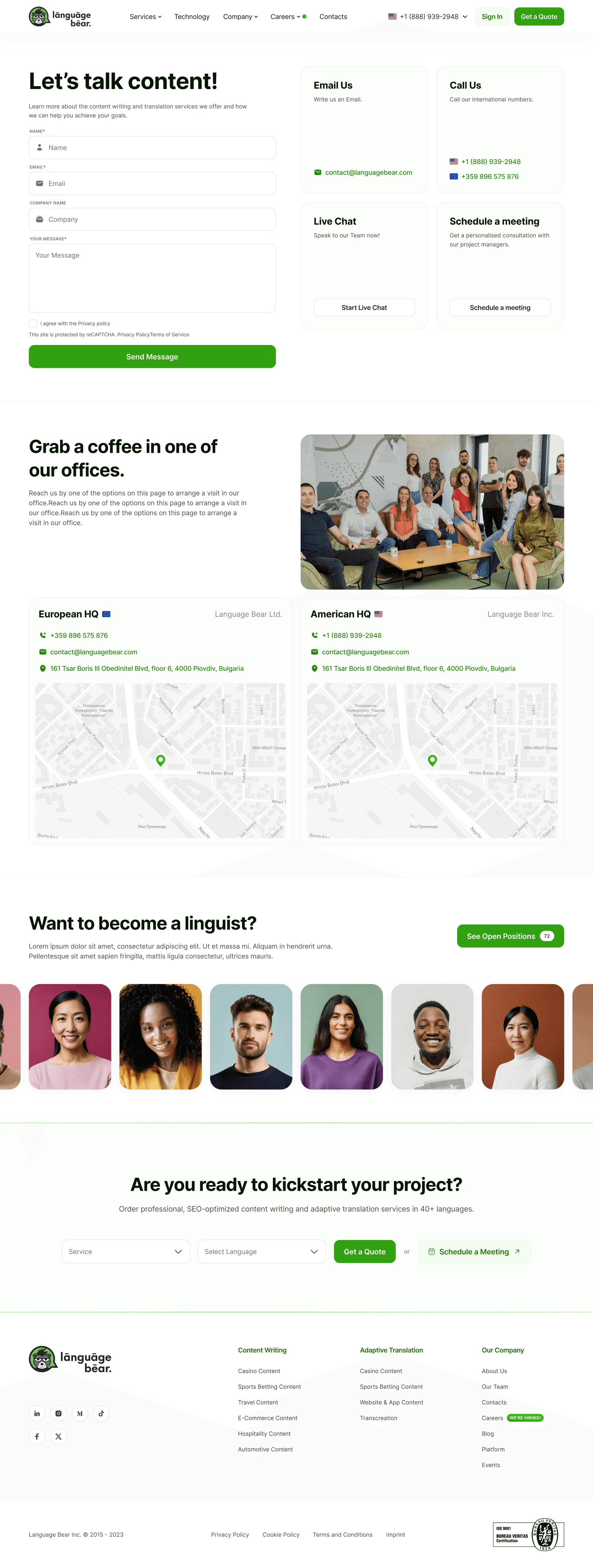
Contacts Page
Problem
The company lacked an efficient and centralized way for potential clients to get in touch. Users abandoned their inquiries due to an unclear contact process or scattered communication channels.
Solution
Designed a contact form optimized for clarity, allowing users to submit inquiries within 1-2 minutes.
Added a “Live Chat” widget to enable real-time interaction.
Consolidated contact methods (email, phone, and scheduling a meeting) into a single location, supported by prominent CTAs.
Desired Outcome
An increase in trust and brand value due to clear navigation and optimized CTAs.
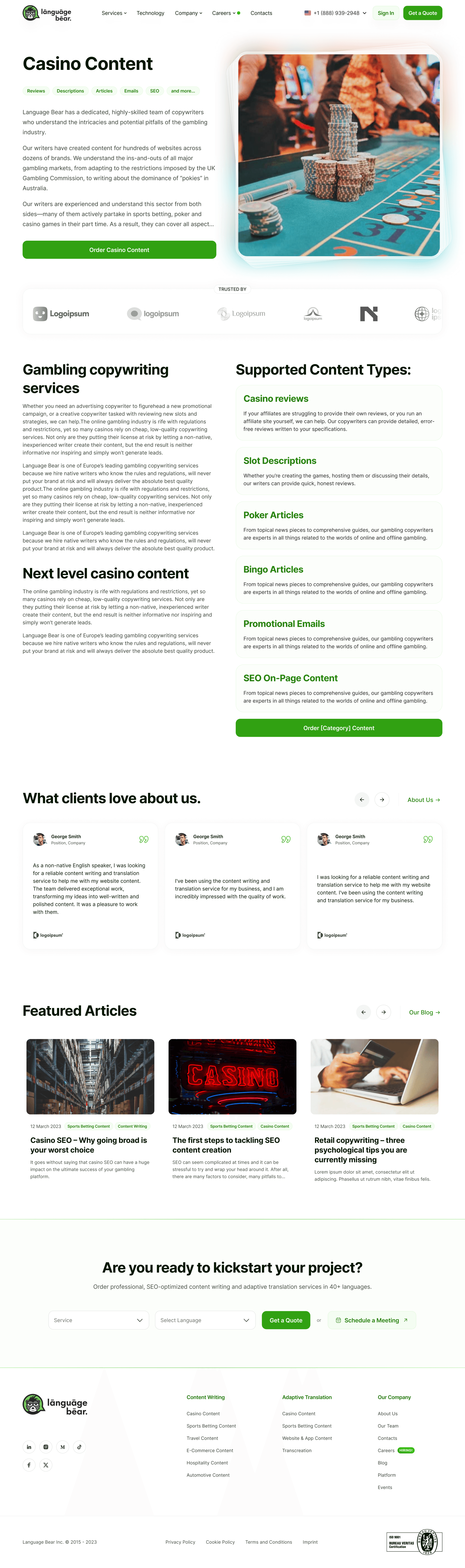
Service Page
Problem
The Service Page had almost no explanatory text and lacked compelling design elements to highlight the company’s core offerings. This led to low engagement rates, missed conversion opportunities and poor SEO.
Solution
Added CTAs, including “Order Casino Content” and “Request Translation Services,” linked to the Get a Quote Page form. Included images, redirections, testimonials, to increase trust.
Desired Outcome
Service Page conversions improved, time spent on the page increased, indicating higher user engagement.
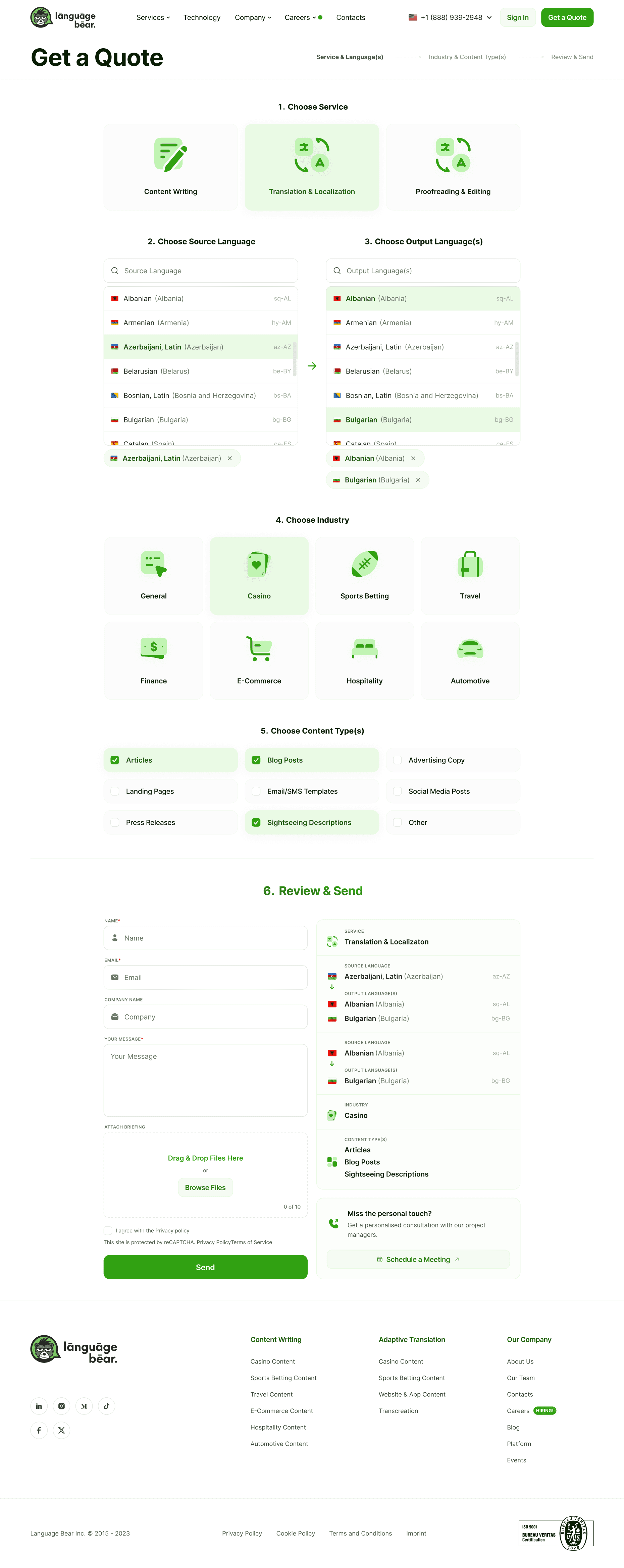
Quote Page
Problem
Previously, the process involved back-and-forth emails, causing delays and frustration for potential customers.
Solution
Designed an intuitive, step-by-step Quote Page that allows users to specify their requirements. with interactive dropdown menus and checkboxes for selecting service type.
Added multi-language support for both source and output languages, allowing users to select from a wide range of options.
Incorporated industry-specific content options (e.g., Casino, Sports Betting, E-commerce) for more tailored quotes.
Designed a drag-and-drop upload feature for users to attach files for reference.
Created a “Review & Send” summary section where users can verify their selections before submission.
Desired Outcome
Service Page conversions improved, time spent on the page increased, indicating higher user engagement.
& 10 more pages
Iconography
Duo-tone
Recognisable
The choice of colors in the duo-tone icons aids in quick comprehension and recognition. The deliberate selection of contrasting colors ensures that the icons stand out and catch the user's attention.
Typography
Legible
Variable
Desktop Scale - Major Third
Mobile Scale - Major Second
Typeface
Inter
Inter is noted for its relatively tall x-height, which makes it exceptionally legible in lowercase and mixed-case lettering. Inter isn’t overly fancy yet not too simplistic. The font also does an excellent job at highlighting super short labels and texts. As a variable font, it meant I can mix and match different weights and italic variations.
Size
Scale - Major Third (*1,25)
18px = 1rem
12
14
16
18
20
23
28
35
44
55
Styles
H1
H2
H3
H4
H5
H6
Body 18px
Body 16px
Body 14px
Caption
Tag
Weight
Regular
Medium
SemiBold
Bold
ExtraBold
Other Projects